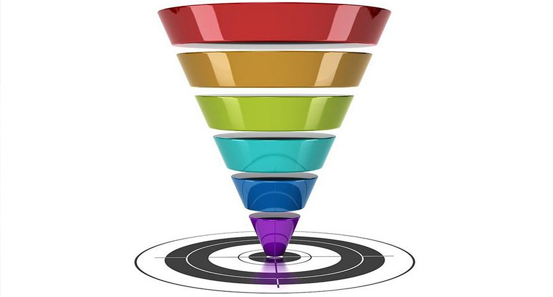
The job of an effective landing page: convert your prospects; pull them down the sales funnel.
If only we could automate the biggest challenge any business faces: convincing prospects to buy. Or at least give us their permission to contact them.
That’s exactly what a landing page does for you.
Done well, and it can be a dream come true: it makes money while you sleep. No more expensive sales staff with their good and bad days. You know exactly how much it costs, and how much it makes.
But making an effective landing page is not an easy job. Done poorly, it will end up being a very sad and lonely place.
What are the elements that make a difference between an effective landing page and a ghost town, visited only by an occasional tumbleweed?
A landing page is where visitors “land” after clicking a link from an ad, e-mail, or another type of a targeted campaign. Effective landing pages are extension of this link. A landing page serves one clear objective, typically moving a visitor down the conversion funnel: e.g. turning a visitor into a lead (by e.g. capturing their e-mail and other info), or closing a deal.
So what does an effective landing page do?
#1. An Effective Landing Page Grabs Visitors Attention
On average, you will get less than 8 seconds to grab the visitor’s attention.
Think about this: they’ve landed on your page while browsing the web. You know very well what sifting through all those web pages means, right?
They are anxious to move on, pressed to make a snap decision if you are worthwhile their attention.
This is a job of a well crafted UVP – unique value proposition. UVP is a single, clear and compelling message that states why you are different and worth buying (Steve Blank).
Here is the minimum of what you want your visitor to understand. In seconds from landing on your page:
- What can I get here? So don’t talk about yourself. Talk about what every visitor cares most about – herself and her problems. What will the visitor get from you and how will that benefit them?
- Is this better or worse than other pages I was looking at? A good UVP needs to stand out. How are you unique, or better from all the other websites they just saw?
Communicating all of these is the goal of your UVP.

Landing page of User Testing.com – crowdsourced usability testing
With User Testing.com, your benefit is: usability testing made really easy. Anyone who has organized a professional usability testing session knows how much time it can go into recruiting the testers, setting up the tests and communicating the results to your team. User Testing.com takes care of it all, for $39 per tester. The end-benefit? “Find out why users leave your website… Use it, and your site will get better”. How is User Testing different? They are the fastest and the cheapest.

Or look at the landing page of KISSMetrics. There is the UVP. And very little else.

KiSSMetrics Landing Page: almost only the UVP.
Lessons. Put the UVP central, in big fat letters. Tell me what I get and how you are different. Talk end-benefits. Do this all in one powerful sentence (perhaps with a byline under the main message). No wonder it takes a hell of a lot of iterations to craft a good UVP! Learn from masters and test different versions.
#2. An Effective Landing Page Communicates in a Simple, Clear and Unambiguous Way
When a visitor lands on your page, the first question they’ll have is:
“What is this? Is this what I am looking for? Or should I hit the ‘back’ button?”.
Answer this question right away. You goal is to capture their interest, so they’ll read on.
User Testing.com (see above) does a great job in explaining a relatively new concept. You know exactly what they offer: for $39, you get a video of a visitor speaking their thoughts as they use your website. In addition, there’s a very effective video on the top right corner of their landing page, which tells you what User Testing.com is all about in the first 10 seconds.

Landing page of NationBuilder
NationBuilder does not tell me what they are in a clear and unambiguous way. This is what I saw when I first look at the website:
- They’re hiring. My eyes went to the top left corner, no surprise there. When the visitor scans a website, this is where they start. According to studies, most people follow a specific “F shaped” pattern when reading web content
- In the meantime, the images on the slider started to move. That made me think this part of the screen is less relevant, and I started to look elsewhere. Couple of seconds later, still not clear! Getting frustrated, I looked back at the images. Ah, people – users I guess. But what does “using film as a catalyst for action” mean?
- Ok, there’s the sentence that explains it: “Community Organizing System”. Unfortunately, community means a different thing to different people. Is it a builder of online communities? Local communities? Communities of practice?
Lessons. Explain what your website / product is, using clear, simple and unambiguous language. Don’t use meaningless adjectives – especially superlatives (“revolutionary”, “unique”, “innovative”). Neil Patel aims to write as a fifth-grader.
#3. An Effective Landing Page Calls the Visitor to Perform an Action
“Call to action”, or CTA, is a key element of the landing page. An effective landing page serves one clear objective: get the visitor to perform a desired action (e.g. sign up, leave their contact info, download, request a demo…). The CTA should compel the visitor to perform that action.
CTA is typically a button, or a link. No surprises – use typical means for engaging visitors in action on the Web.
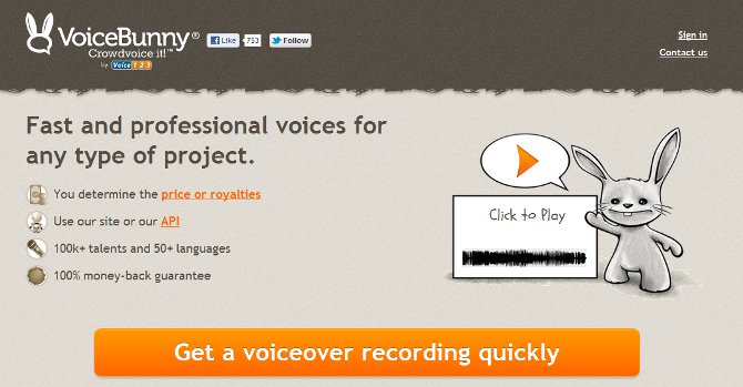
VoiceBunny features a high contrast, big bright-orange CTA button. They also tell you what you get if you click: a voiceover recording (and quick!)
Unfortunately, VoiceBunny breaks the rule of “one objective per landing page”. It contains many different CTAs. There are 6 links and 7 buttons you can click!
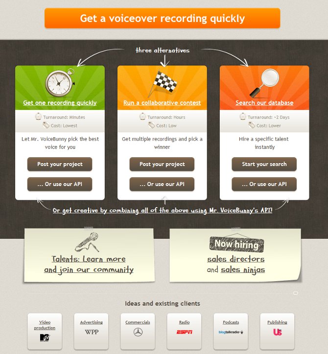
6 different links and 7 buttons you can click!

CTA of Micromobs is strategically positioned in the middle, right under their UVP. It makes it really simple to immediately “consume their value proposition” (start a mob). Unfortunately, at this point I still don’t know what a “mob” is. I would appreciate a small explanation under the CTA (perhaps with a “learn more” link).
Lessons. The best CTAs:
- Have a single objective
- Represent the only action you can take on the landing page (e.g. no menus or links that take you elsewhere)
- Stand out (e.g. using high contrast, bright colors, strategic placement on the page…)
- Are designed and formulated as a call to perform an action – often starting with a verb (e.g. get, sign up, start, download…)
- Make it clear what you get when you click on them
#4. An Effective Landing Page Reduces Anxiety
A landing page is a lot like a sales conversation. If you’ve done a really good job, you’ve awakened your prospect’s desire. But before you can close the deal, you still need to address any objections they might have.
The trouble with impersonal communication of a landing page is that the visitors will not communicate their objections like they might in a face-to-face conversation. The way I see it, you’ve got 3 options to deal with that.
Option 1: address any objectives upfront. This is always a good idea, even in a face-to-face conversation. Brainstorm any objections or risks your customer could perceive. Put yourself in the shoes of the customer and think about:
- Financial risk – help them justify their return on investment (ROI). Show them how fast they will reap the benefits if they use your product
- Product-needs fit risk – help them evaluate if the product is the right fit for their needs. Provide information about product features, FAQs, demo, or a free trial…
- Competitor risk (choosing the wrong solution) – help them understand why you are a better fit for them than the competing solutions
- Compatibility risk – help them understand how your solution will fit in their way of working (and if relevant how it will integrate with their other tools)
- Look at this extensive list of 85 typical sales objections for more ideas
Option 2: provide your customer an opportunity to raise objections. Make it easy for them to provide you feedback or ask questions. Set up a live chat (e.g. Olark, SnapEngage…). Or use a service like UserVoice that lets you integrate a feedback form right in your website. Another cool tool is KISSInsights, a lightweight survey tool that you can integrate right into your web page.
Option 3: give them a money back guarantee. Make it risk free.
#5. An Effective Landing Page Builds Trust and Credibility
In the scammy world of Internet, who is to be trusted?
People buy from people. People they trust. So you need to build that trust.
One great way to build trust is using testimonials. Highrise from 37signals takes this very far.
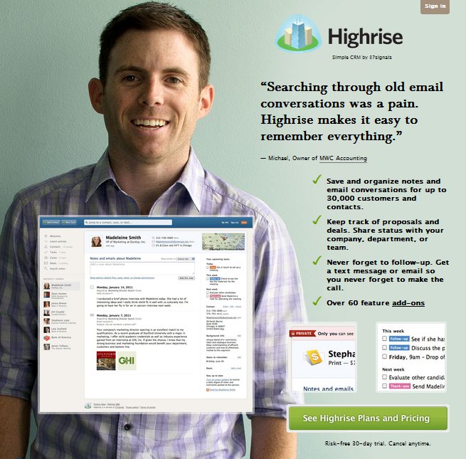
Highrise from 37 signals features the image and the testimonial of a customer as the central piece on their landing page. Interestingly, if you reload the landing page, the customer and the testimony changes
Other forms of social proof include press articles (“as seen in…”), but also social media (XYZ people like this on Facebook, or have tweeted about it…). BTW, if you’re finding this article useful, why not share it to help others?
A very effective strategy for building trust and credibility is content marketing. By producing and giving away superior content (blog posts, e-books, webinars, video tutorials, interviews…), you establish yourself as an authority (a “thought leader”) in your niche. Which brings me to to the next point.
#6. An Effective Landing Page Gives Some to Get Some
Landing pages are often built to convert visitors into leads. Often by calling them to subscribe their e-mail to a newsletter. Increasingly, companies will give you a “free bribe” (e.g. an e-book or a webinar…) in exchange for your e-mail address.
So the call to action will be to register for a webinar, or download an e-book or a free report.

HubSpot Gives you a free workshop, or lets you download a guide in exchange for your e-mail
Providing free content is usually a part of a broader content marketing strategy. A face-to-face sales rep will often have to visit their customer several times before the customer is ready to sign. A good sales person knows the importance of a relationship they build with their customers. Signing people up for a newsletter or an e-mail course, and then delivering high quality content on a regular basis can help you build this relationship in the faceless context of the Internet.
And once they land on your page after consuming such a high quality content for a while, they are not anymore a cold lead.
#7. An Effective Landing Page Provides Convincing Information You Need to Make a Decision
Landing pages are sometimes sales pages, meant to convert a lead into a paying customer. They have one of the most difficult jobs – convincing people to part with their hard earned cash.
Here are some tactics employed by effective sales pages:
- Point out everything you are getting for the price – right next to the CTA
- Make it a great deal – by throwing in extras, rebates, etc.
- Create a sense of urgency (e.g. for limited time only, limited number available…)
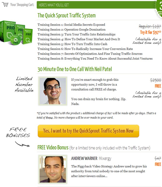
Look at all the stuff you get when you buy the Quick Sprout Traffic System from Neil Patel. In addition, it’s heavily discounted, and there’s a *limited* number of consultations with Neil
#8. An Effective Landing Page Looks Great
How do you think people judge credibility of a website?
The number 1 criterion they use?
They assess if the web site looks professional. This is according to a large study from the Stanford University. Here’s a couple of comments from the study’s participants:
- This site is more credible. I find it to be much more professional looking — M, 38, Washington
- More pleasing graphics, higher-quality look and feel — F, 52, Tennessee
- Just looks more credible. — M, 24, New Jersey
- Actually, despite the subject of the Web site, it looks very credible. This may be due to the subdued color scheme and the font used on the left-hand side of the page. — F, 29, California
- I know this is superficial, but the first thing that struck me is the color difference. The site is a soothing green (sort of like money) while the [other] site is a jarring purple. — M, 56, Virginia
- The design is sloppy and looks like some adolescent boys in a garage threw this together. —F, 48, California
- Not very professional looking. Don’t like the cheesy graphics. — F, 33, Washington.
- Looks childish and like it was put together in 5 minutes. — F, 25, Maryland
Still here? Great! Have I missed some essential elements? Help the other readers and add your tips in the comment section.